
Statistics in Year 6 (age 10–11)
In Year 6, your child will read and make pie charts and line graphs. They will also calculate and interpret mean averages from sets of data.
The key words for this section are continuous data, discrete data, and pie chart.
What your child will learn
Take a look at the National Curriculum expectations for statistics in Year 6 (age 10–11):
Read and make pie charts and line graphs and use them to solve problems
Your child will connect their work on angles, circles, fractions, and percentages to draw and interpret pie charts. This will involve:
-
- Illustrating and naming parts of circles, using the language radius, diameter, circumference, and centre.
- Knowing that the diameter is twice the length of the radius.
- Knowing that are 360° in a circle and relate this to pie charts (for example, 360° shows 100% of the data).
Your child will also be able to interpret information from line graphs.
Calculate and interpret mean averages
Your child will know when it is appropriate to find the mean of a data set. For example, it would be appropriate for finding the average daytime temperature over a week. It would not make sense to try to find the mean average of favourite ice cream choice.
How to help at home
There are lots of everyday ways you can help your child to understand statistics. Here are just a few ideas.
1. Create a line graph
Line graphs are used to show information that changes over time. Your child will use them to represent continuous data such as temperature, which can have an unlimited number of possible values within a selected range. Your child will plot the values on a graph from data they have collected or using data given to them, and will join each point together with a continuous line.
Why not measure and record the daily temperature over a period of time? Ask your child to make predictions about what data they expect to collect. When you have collected the data, discuss what their graph may look like and then have a go. Remember, they may have to extend the scales on the graph to include negative numbers.
As an example of what this might look like, here is a graph showing the overnight temperatures recorded between 10pm and 4am one evening during the winter:
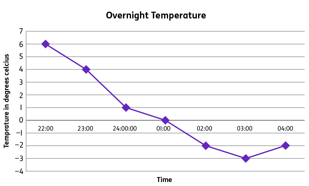
Once your child has created their graph, encourage them to ask and answer questions. For example:
What was the highest and lowest temperatures and when did these occur?
How much did the temperature fall between 11pm and 3am?
How long did the temperature stay below zero?
Can you estimate the temperature at 11.30pm?
2. Investigate pie charts
A pie chart is a circular chart which is divided into sectors that represent parts of the total. Pie charts are used to represent discrete data (data that can only take certain values) and is used to show different sizes.
At school, your child will use their understanding of circles to interpret pie charts. For example, they will be able to name parts of circles, using the language radius, diameter, circumference, and centre.
They will also understand how to calculate fractions from pie charts. For example:
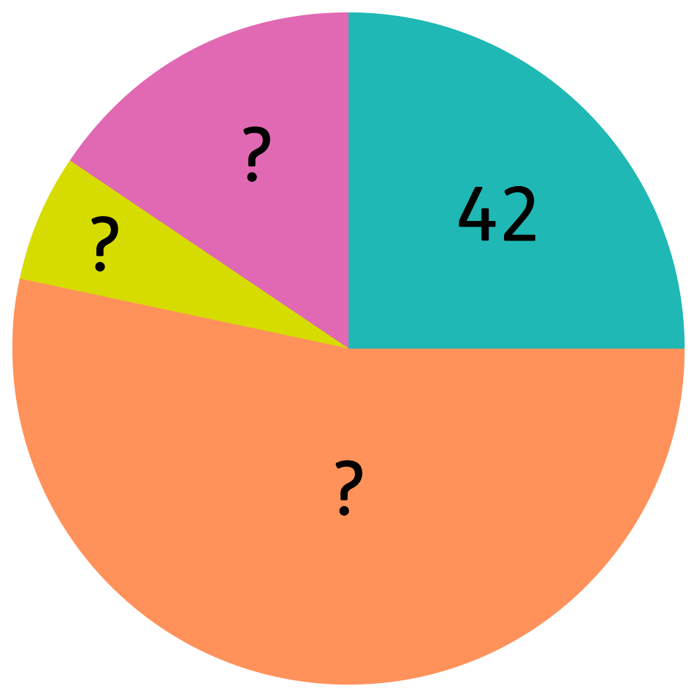
Look at the pie chart below. The blue section represents 42 people who took part in a survey. Can you find the total number of people who took part in the survey?
Looking at the pie chart, we can tell that a quarter of the pie represents 42 people.
Therefore, the whole pie chart represents four groups of 42, which is 168 people (42 × 4).
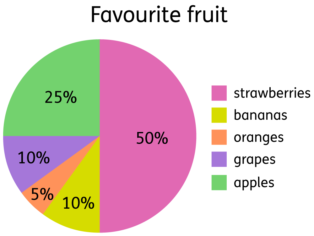
Your child may need to interpret data from pie charts using percentages to represent each sector. For example:
In the pie chart below, 200 people answered a survey asking about their favourite fruit:
How many people chose apples?
25% of 200 people = 50 people
How many more people voted for strawberry than apple?
100 – 50 = 50 more people
What was the total number of people who chose grapes, oranges, and strawberries?
20 + 10 + 100 = 130 people
Your child will also construct pie charts by finding the size of each sector in degrees and using a protractor to measure the angles accurately. They will know that angles in a circle total 360° and that this represents 100% of the data in a pie chart. For example, if a sector represents 50% of the pie chart, this is equivalent to 180°.
3. Find mean averages
The mean is one type of average. You can find the mean by adding together all values in a set of data, and then dividing your answer by the total number of values.
Try to explore this in real life. For example, you could investigate the mean number of goals per match your child’s favourite football team has scored in the last ten matches. Here is an example:
The number of goals scored per match is: 3, 2, 0, 1, 2, 1, 3, 2, 2, 4. What are the mean average goals per match?
Find the total number of goals first: 3 + 2 + 0 + 1 + 2 + 1 + 3 + 2 + 2 + 4 = 20
Divide 20 (number of goals scored) by 10 (number of matches) to find the mean: 2 goals per match
Alternatively, your child could work out the mean number of minutes it takes to walk to school over a week, or the mean temperature of a given week, or the mean score of their latest tests at school. There are all sorts of places the mean average can be really useful and interesting!